
%20(1).jpg)
ADVERTISEMENT


Asian Paints ColourNext Launches Colour Forecast Stories and the Wallpaper of the Year
March 6, 2023
Mrinmoy Dey
Asian Paints ColourNext, one of the most authoritative voices in the Indian subcontinent for trends and material forecasting completed 20 years this year. ColourNext continues to share design directions for the year inspired by the cultural and social influences on colour and decor trends.
ColourNext revealed the four forecast design directions for 2023 – ‘Gothilicious’, ‘Edge of the Forest’, ‘Sleep Sense’ and ‘Shroom’, the stories of which address sociocultural topics ranging from how we express ourselves, to a newfound urgency for wellness, and forming deeper connections with others and the world around us.
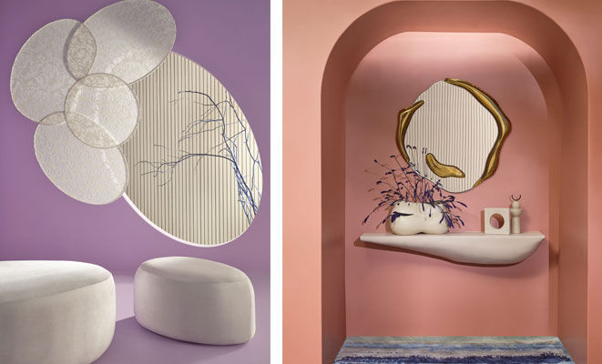
The forecast also launched Wallpaper of the Year – Aion, breakthrough natural and earth-safe paint - Nilaya Naturals, and imaginative palette of wall finishes called Material Finishes by Royale Play.
ColourNext’s forecast for 2023 is all about building a better future, embracing the past and present and creating with joy, hope and intention. The year is the silver lining everyone waited for, after the dark clouds of the past few years and the colour of the year 'Silver Escapade' encapsulates the optimism with which we are going forward. On the occasion of ColourNext’s 20th edition, Asian Paints has also launched the new logo for ColourNext.

Colour of the Year - Silver Escapade was unveiled as a representative colour of the times we live in. Photo Courtesy: Asian Paints

Amit Syngle, Managing Director and CEO, of Asian Paints Ltd. commented, “As we celebrate 20 years of ColourNext with pride & zest, we look ahead to share with the world, the colour and material forecast for the year. The design directions for the year - Gothilicious, Edge of the Forest, Sleep Sense and Shroom highlight self-expression, wellness, fantasy and connecting with the world, addressing socio-cultural and consumer shifts which have emerged from getting out of a rather difficult and tough phase of the last two years. The Wallpaper of the Year- Aion speaks about time and eternity through art and design and Nilaya Naturals along with Material Finishes by Royale Play align perfectly with our forecasted themes for the year. We are excited to see the multitude of interpretations of our directions across landscape and medium. It is definitely going to be an interesting year where we see the application of our forecast and our colour and material intelligence behind them come to life.”
The dazzling and enchanting Wallpaper of the Year, Aion has a mesmerizing visual palette with deft use of tones in different sections of the design. In the foreground, strong powerful and modern graphic lines, blaze with a white intensity. Receding totem silhouettes signal the way back into myth and mist, hanging chandelier-like against a soft wash of colour.
.jpg)
There is a shift towards an understated gothic essence with colours. Photo Courtesy: Asian Paints
Gothilicious is the trend of self-expression and being unapologetically bold and sensual. It can be seen as challenging the traditional ideas of dark and nebulous and exploring the intensity of pensive and powerful human emotion. There is a shift towards an understated gothic essence with colours like charcoal warm matt black, deepest dark skies, blackest black pigment, deep dark forest olive greens, dark reds, sheen & shimmer of mother of pearl and molten metal.
.jpg)
This forecast story includes deep forest greens, mud, moss browns and mystical fluorescence inspired by wildflowers, rare bees, bugs and worms, along with the magical sheen and shimmer of gleaming lake waters. Photo Courtesy: Asian Paints
Edge of the Forest is a life-affirming and a restorative forecast story. When the pandemic hit we were clouded with loneliness, people found themselves turning to nature for answers, as per big data reports. This is because people know from instinct that nature allows them to connect to a world larger than themselves. Inspired by unfiltered forests, woods and its many enchanting creatures, this forecast story includes deep forest greens, mud, moss browns and mystical fluorescence inspired by wildflowers, rare bees, bugs and worms, along with the magical sheen and shimmer of gleaming lake waters. This trend signifies reconnecting with nature and its joy and vitality and a new kind of ‘inland living’ at the edge of the forest.
Sleep Sense refers to a new frontier in wellness – a sleep revolution i.e. prioritizing good quality sleep and rest of mind as the movement towards health, wellness and slow living gains ground. There is a renewed focus on breathable, handcrafted fabrics and locally sourced natural materials. The overall colour palette is a collection of broken whites that give a feeling of stillness and lightness. Comforting, nourishing, soft adaptive, familiar, and tranquility are the colour and material qualities of this forecast story.
.jpg)
The overall colour palette under 'Sleep Sense' is a collection of broken whites that give a feeling of stillness and lightness
Shroom is a story of revival and rebirth. It involves taking all that is dead and turning it back to life, in many ways mirroring the year itself, as people come out of the biggest health scare this generation has witnessed. It seems simple from the outside but has complex layers of ecological memory. A palette of profound tones combined with luminous and saturated hues with mesmeric quality make up this forecast story.
A palette of profound tones combined with luminous and saturated hues with mesmeric quality make up this forecast story. Photo Courtesy: Asian Paints
Earlier this year, Colour of the Year - Silver Escapade was unveiled as a representative colour of the times we live in. Wellness and hope for the future have emerged as the two most important design trends this year which inspire silver, a ubiquitous colour of hope, festivities and glamour. Silver has been the colour of auspicious new beginnings in India for centuries. Given the hybrid lifestyles we live, the colour is timeless and expansive transcending physical and digital realms, the past, present and the future.
Video Description
Related Articles
Advertisement